UX/UI | Branding
The Problem
As deforestation becomes an ever-growing problem in our world, people are looking for new and easy ways to help the environment. The user needs a convenient and exciting way to help the environment, simply by using their phone. “Ecosia” is a search engine app dedicated to using its profits to planting trees around the world. This app needs a rebrand to fully engage with its users.
The Solution
Rebrand and design an app for “Ecosia” to make it easier to use, as well as entice the user to keep coming back to the app. The app needs more incentive for the user to use it.
Research
Must
Donate Option
Follow projects/notified on updates
Share projects/articles
Display personal tree count
Access to search bar at all times
Should
Choose where trees are planted
Be able to donate to specific project
Keep track of trees as they grow/name them
See map of all the trees user has planted
Offer access to company finance reports
Could
Pop up notification when user has planted tree
Earn rewards after “x” amount of trees
Monthly subscription offer
Magazine (digital/physical)
Won’t
Have social media aspect
Force users to sign up to use the search
Require payment information upfront
Have age requirement
Prototypes
BRANDING
Original Logo
Rebrand Logo
Original App Icon
Rebrand App Icon
FINAL SCREENS
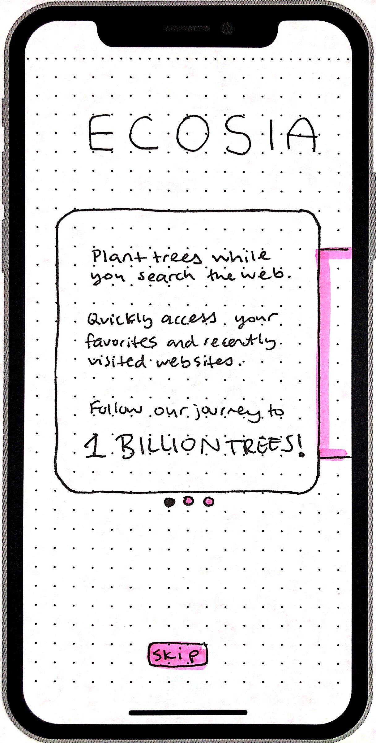
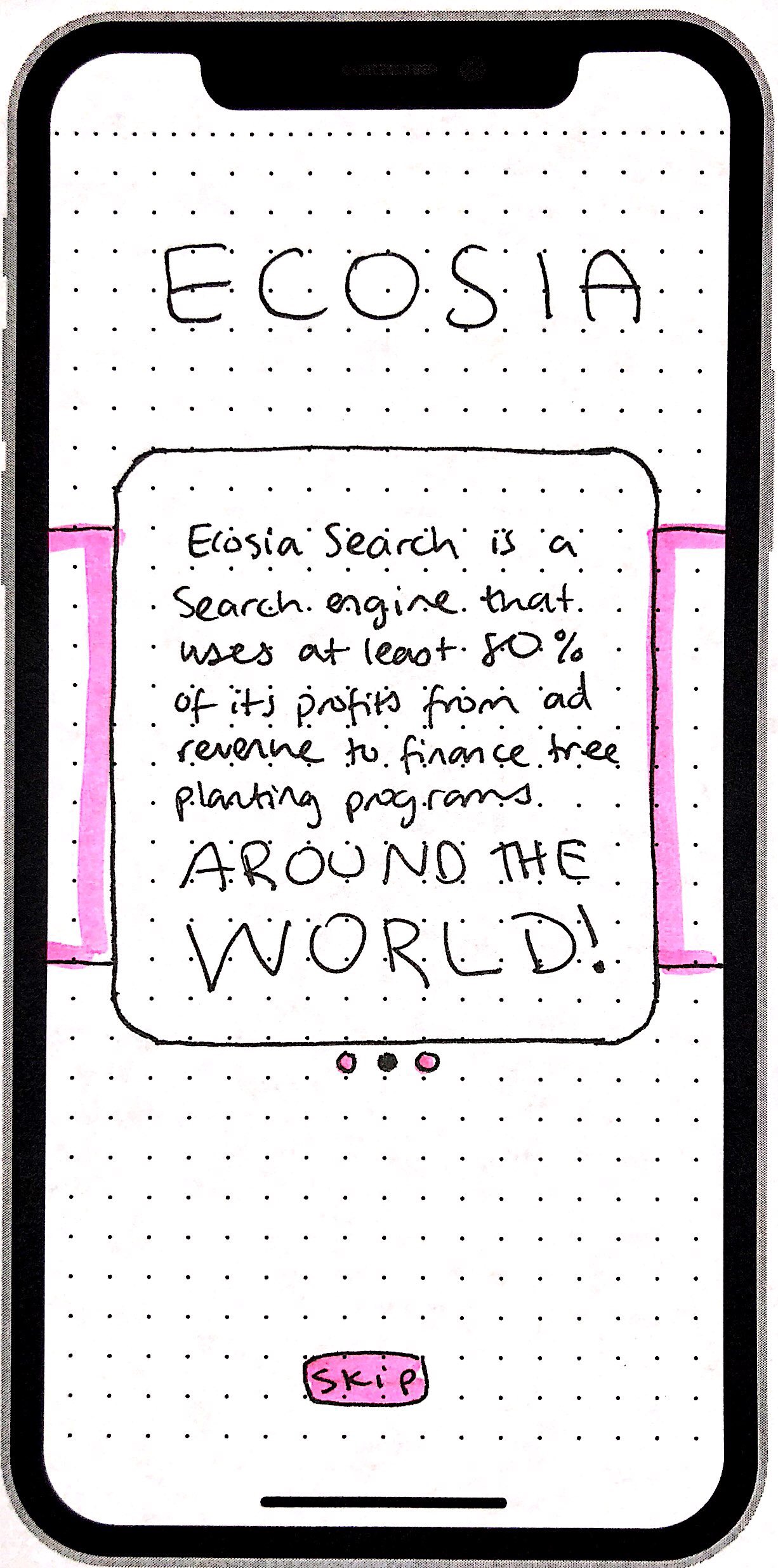
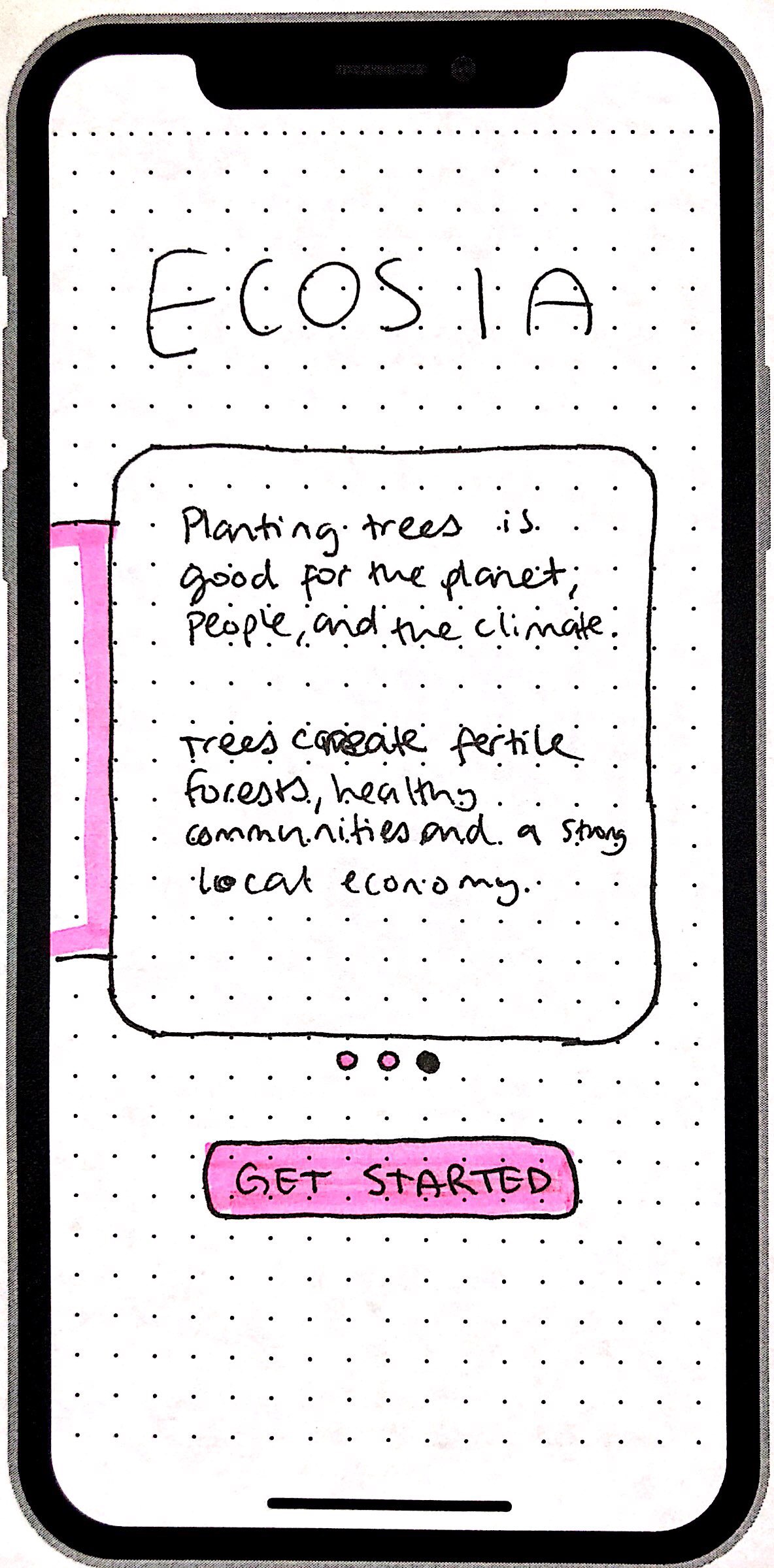
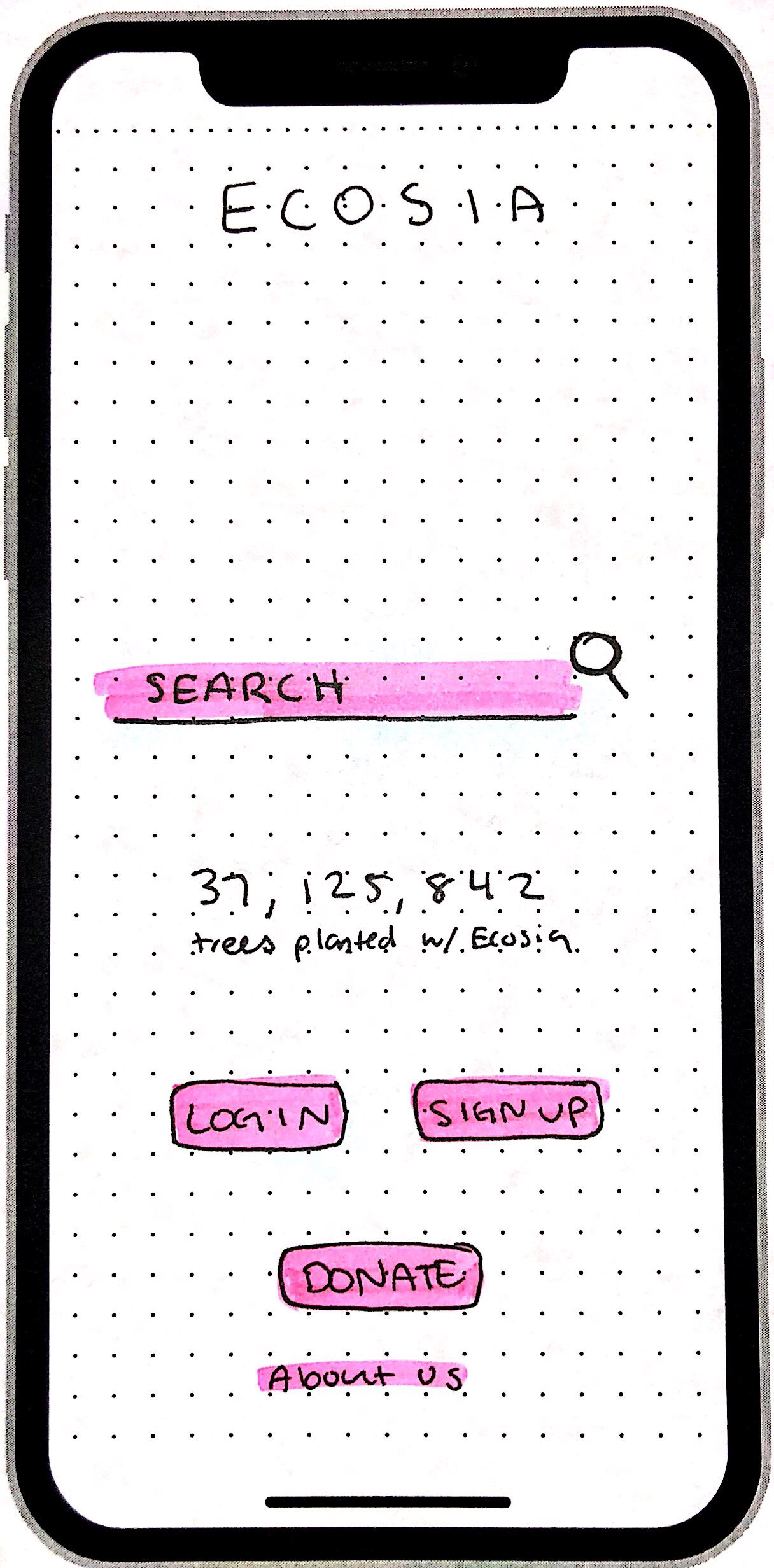
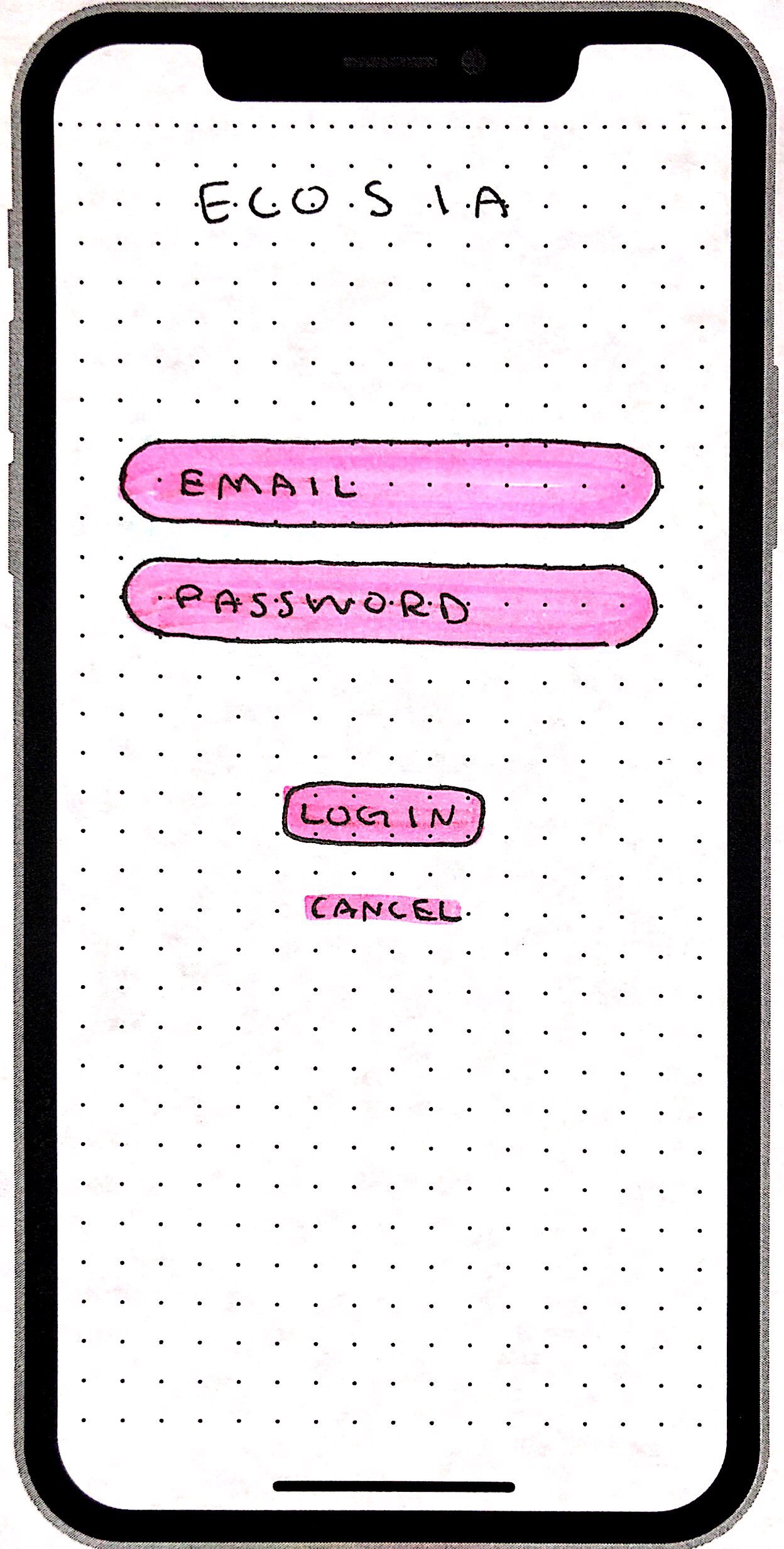
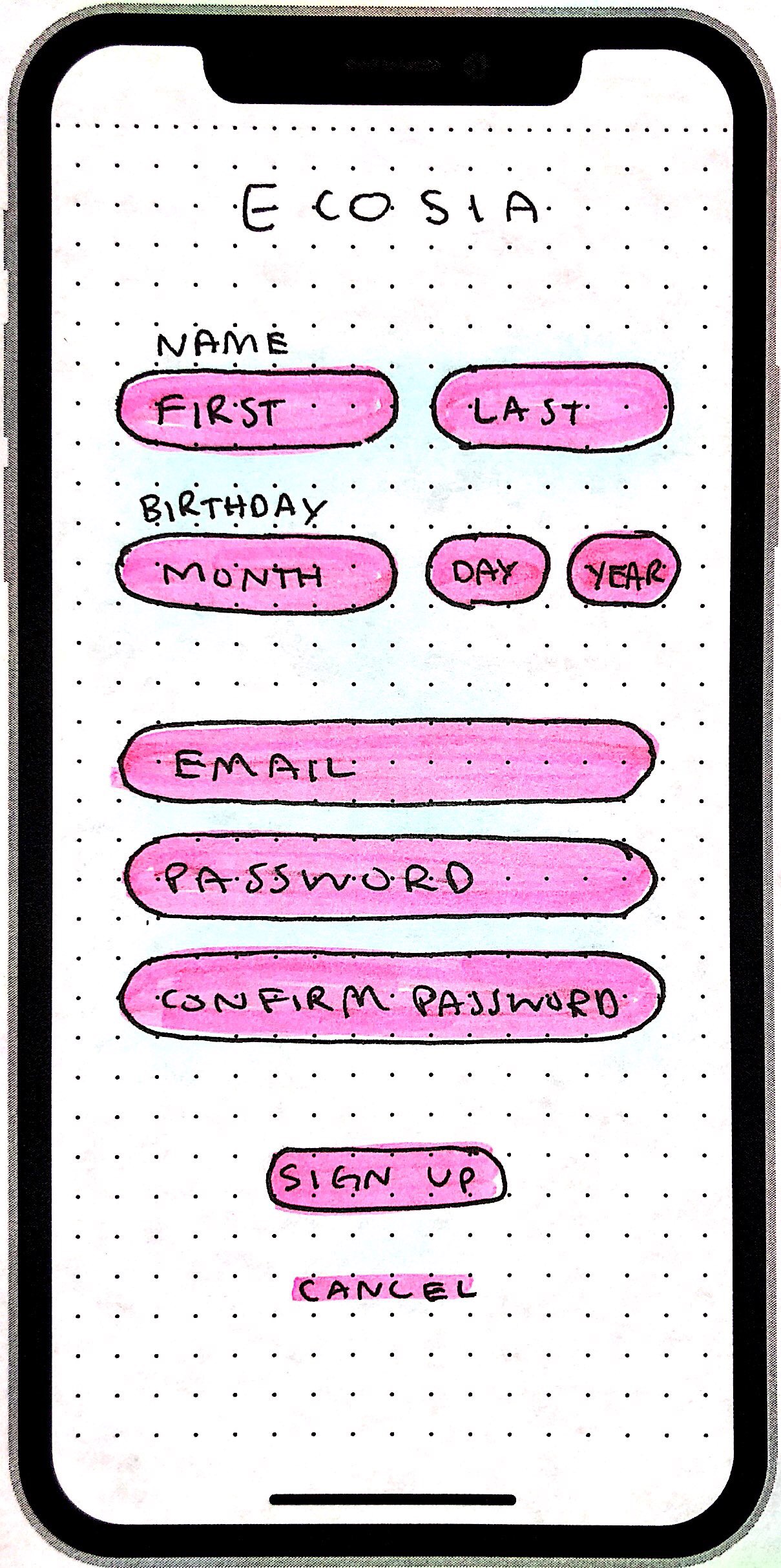
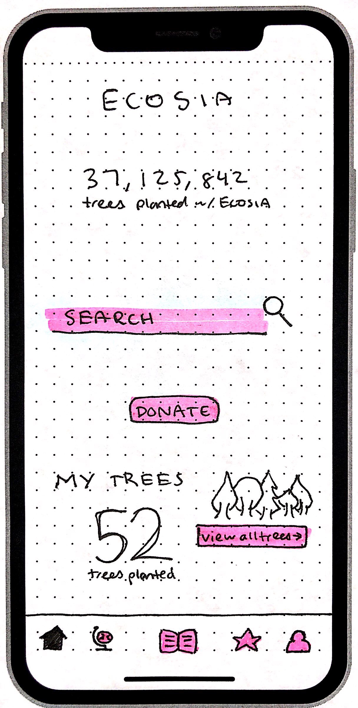
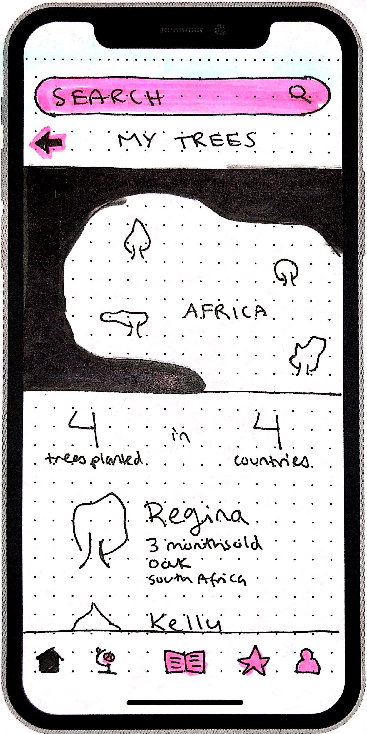
The user has the option to login/signup with the app if they want more features, or they have choice to just use the search feature if they only want to help in planting trees. If they have an account, they can view “their trees” and keep track of the trees the company has planted on their behalf. This is a fun way to personalize the experience for the users where they can name their trees, see where they are located, and see how old they are.
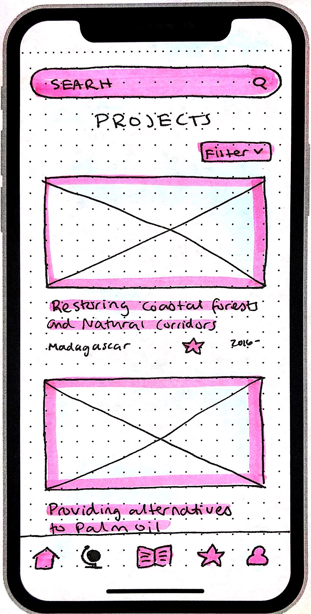
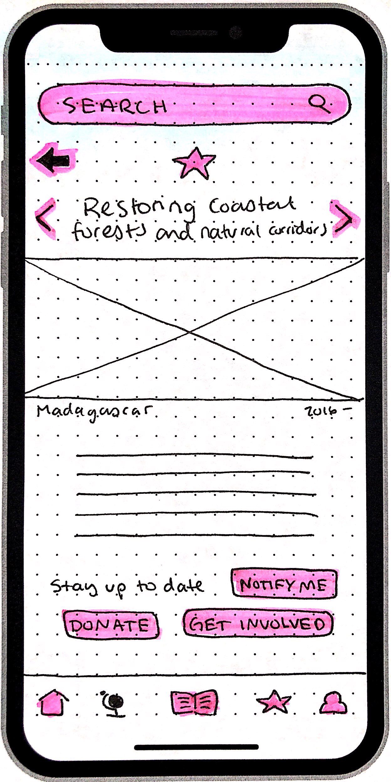
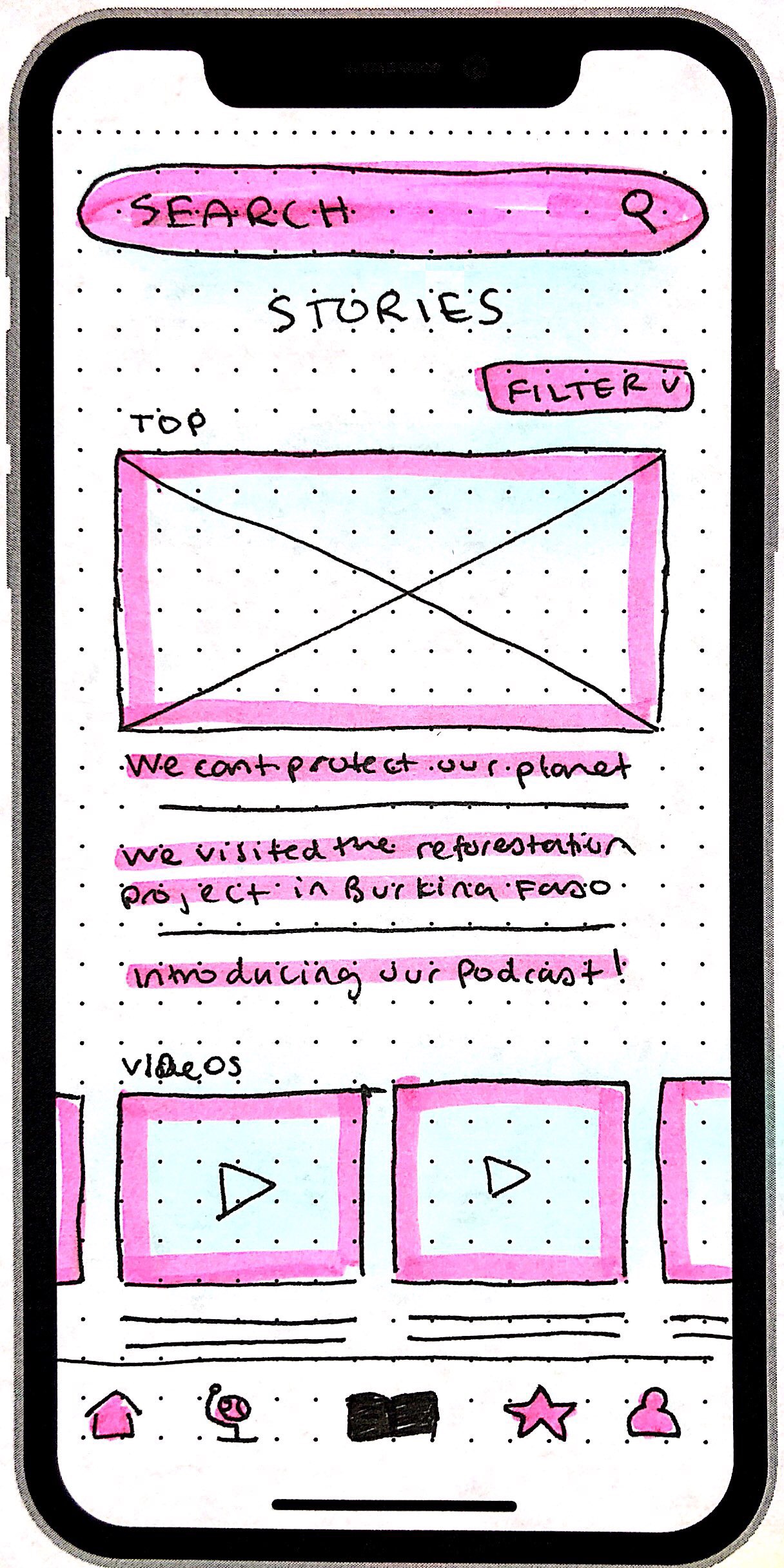
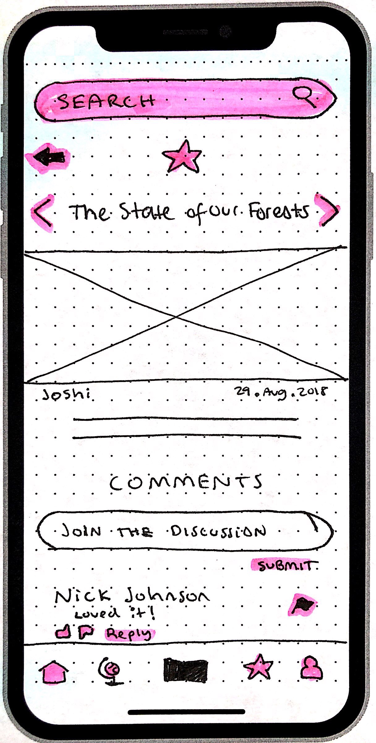
Users can read about specific projects that Ecosia is working on and have the option to follow those projects as well as donate to those specific projects. The app also features stories, which are daily updated articles that discuss environmental issues going on in the world, that users can read as well as comment on in order to build a sense of community between the users. This is also a great features for the article writers so they know what articles users like more than others, and that way they can tailor their stories to their users.
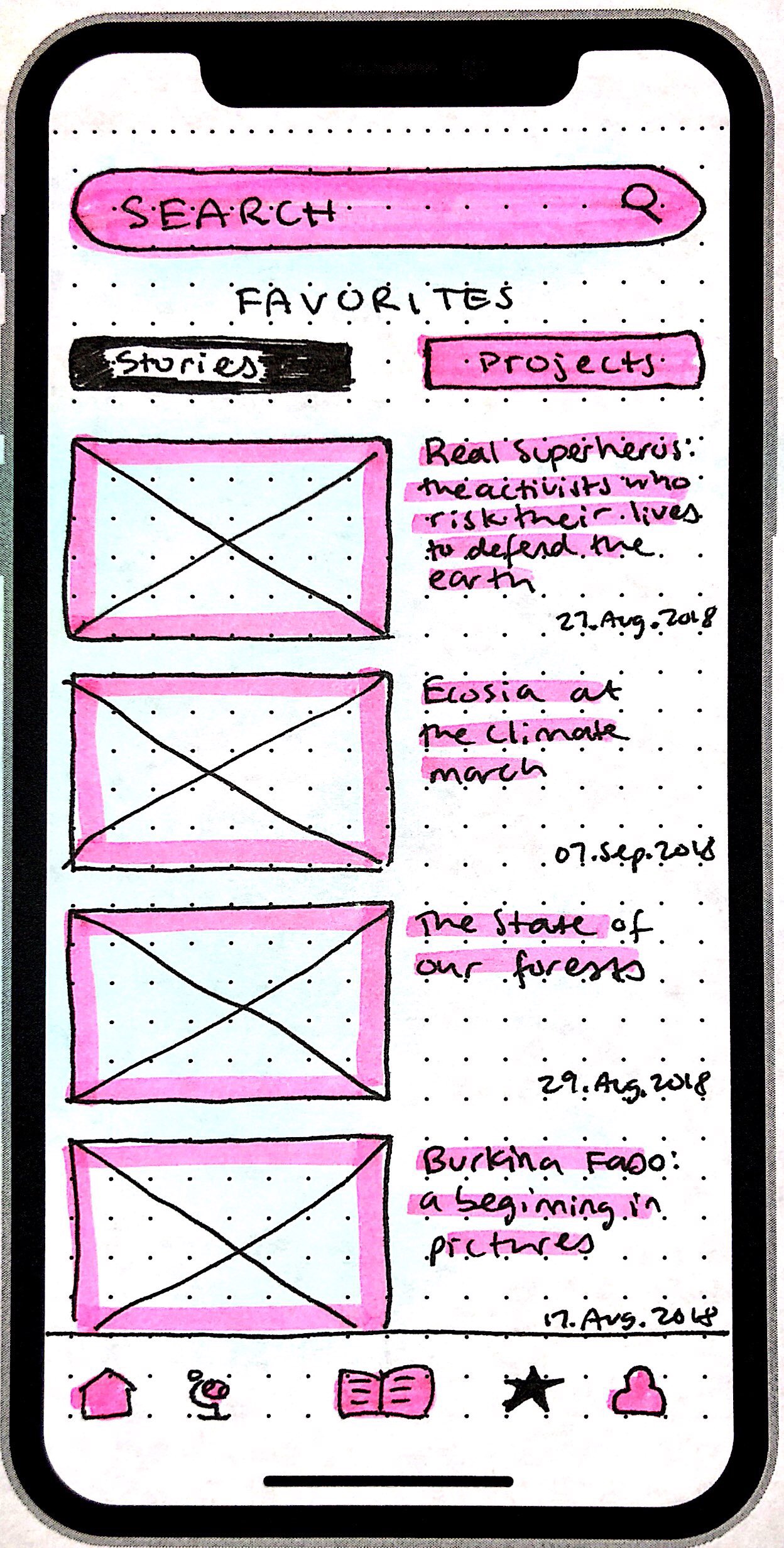
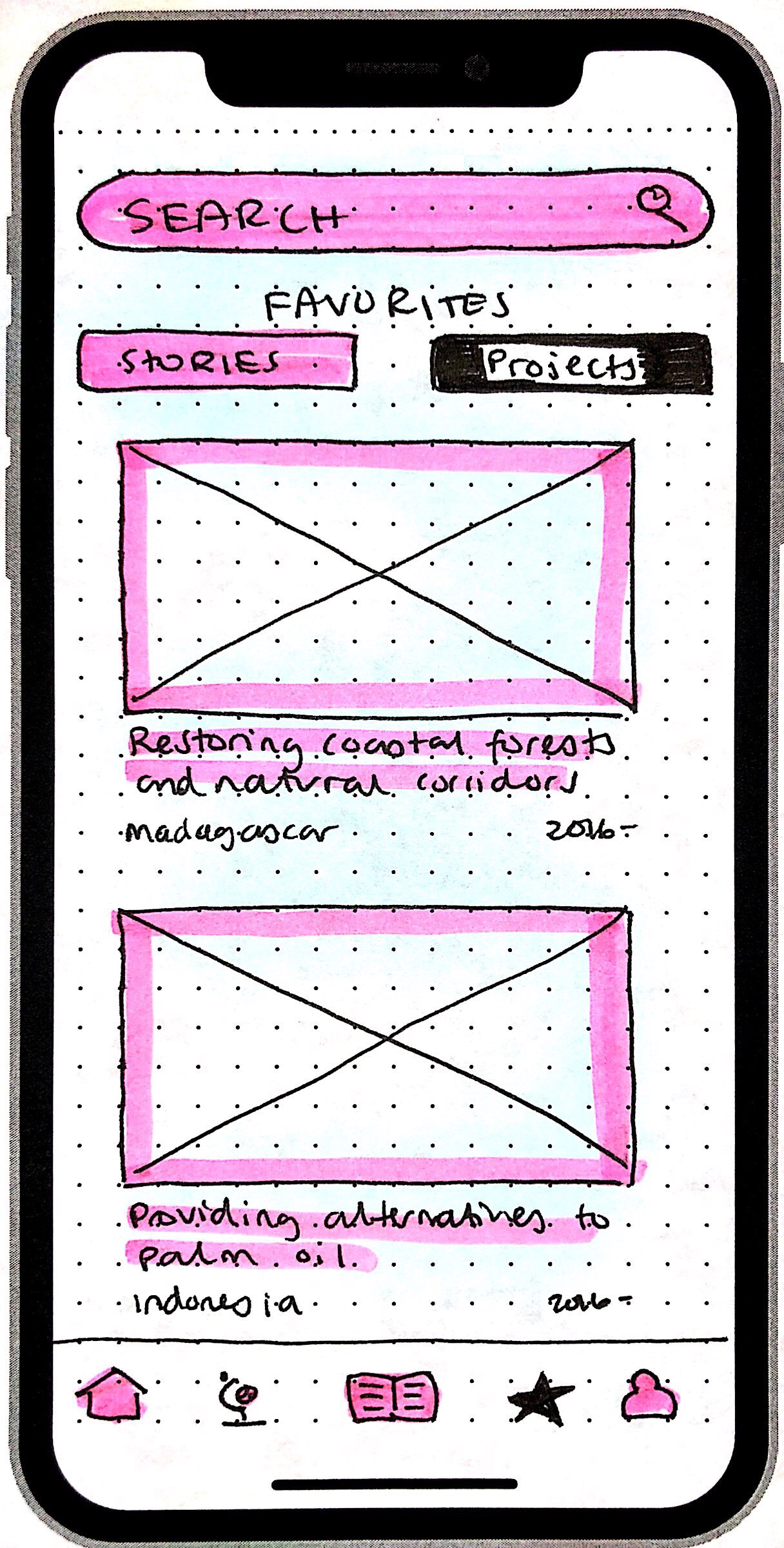
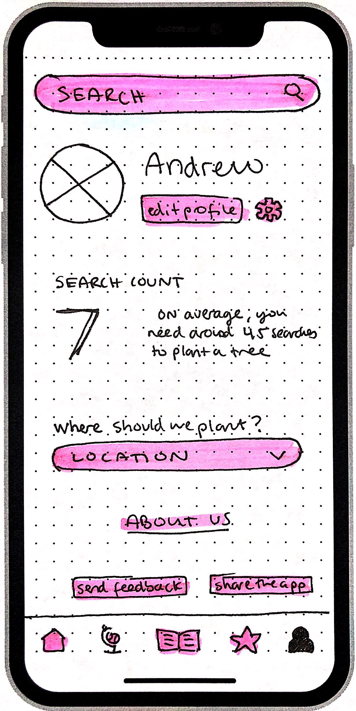
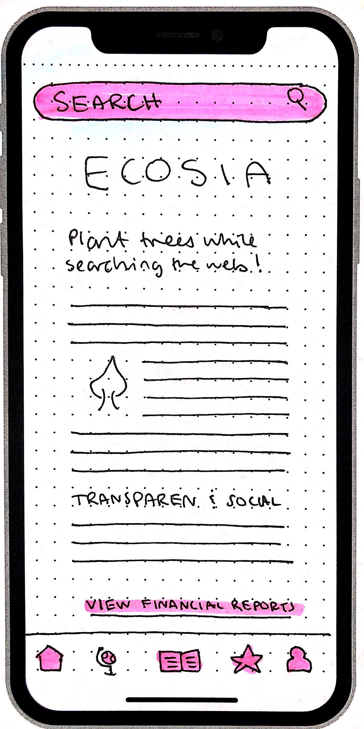
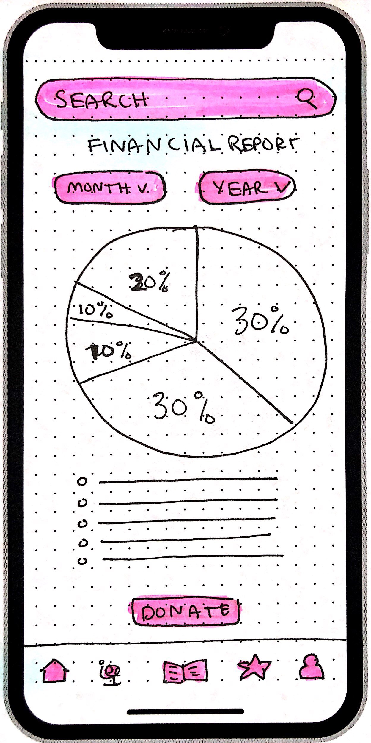
Ecosia features a section where users can visit their favorites projects and stories they have saved over time. Under the user’s profile, this will show their search count so they can see how far they are to their next tree, where around 45 searches is needed to plant a tree. From there, under about us, user’s can read more about the company and their finances. Transparency is very important to Ecosia, so having their monthly report easily accessible in a clear and easy to digest fashion is needed for the users.
While the app makes money through advertising and more people using the app, it also relies on donations from regular people, not just big corporations. It is important that the donate section should be clear, concise, and welcoming for the user.
